Zeppelin Universität
From 4 Silos to 1 Hub: A Unified University Newsroom.
My Role
Lead UI/UX Designer
Timeline
3 Months
Tools
Figma
Skills
UX Research, UI Design, User Task Flows, Prototyping
The Problem
The university’s digital ecosystem was fragmented, creating massive friction for users:
Information Silos: Students and professors were isolated, only seeing updates from their specific departments rather than the entire university.
High User Friction: News, events, and research were scattered across different domains, resulting in frustratingly long clickpaths.
Inconsistent UI: The decentralized setup led to mismatched visual designs and confusing information architectures.
The Solution
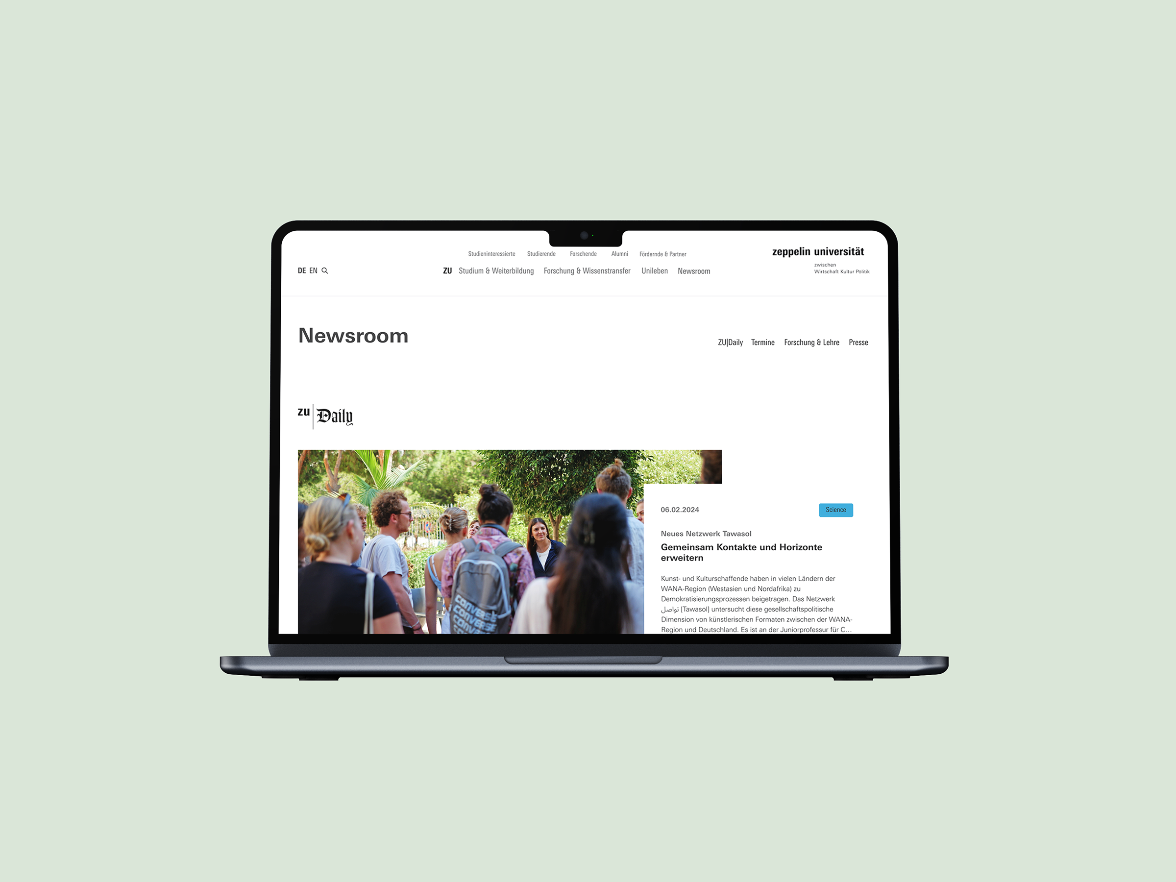
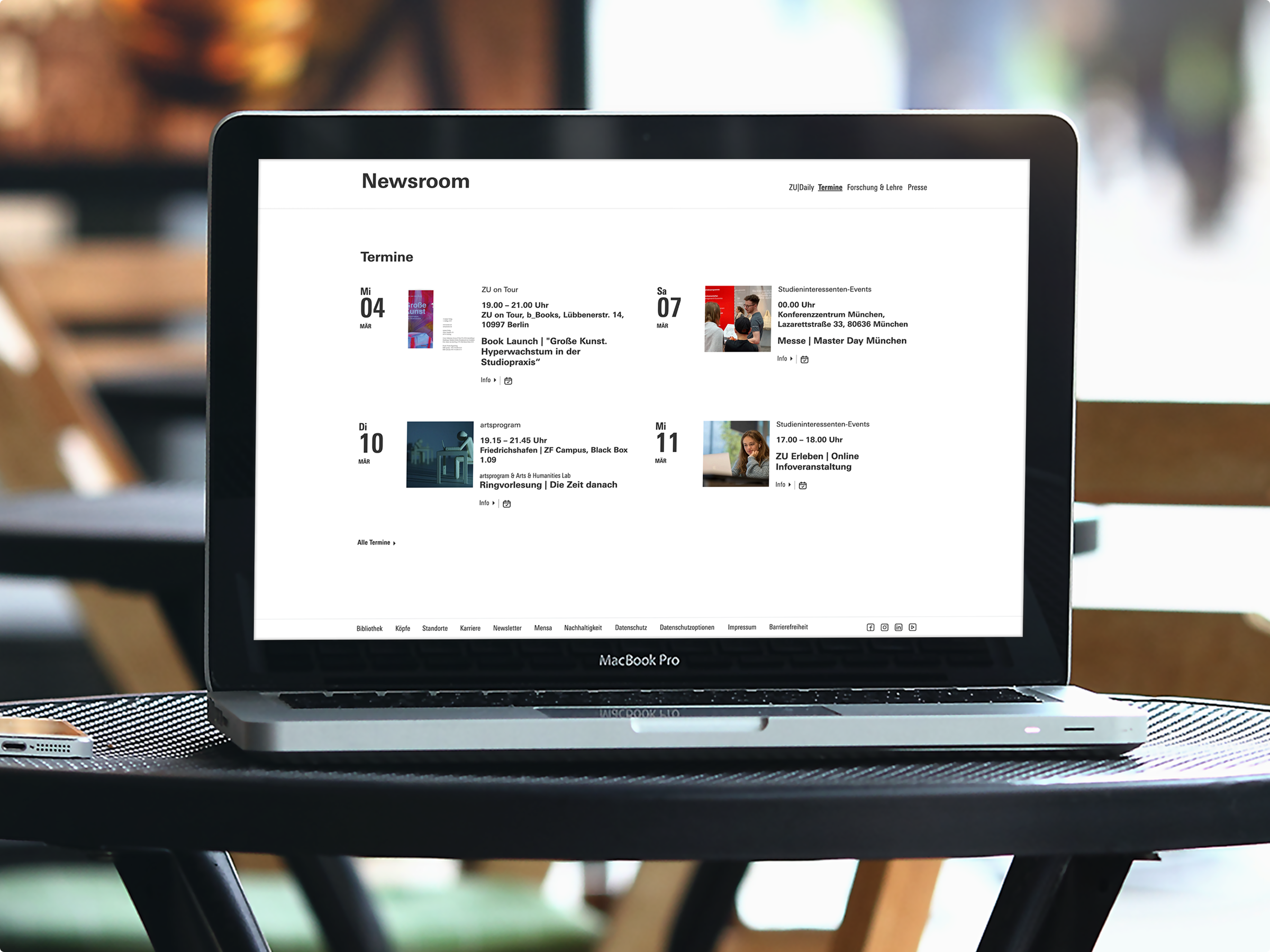
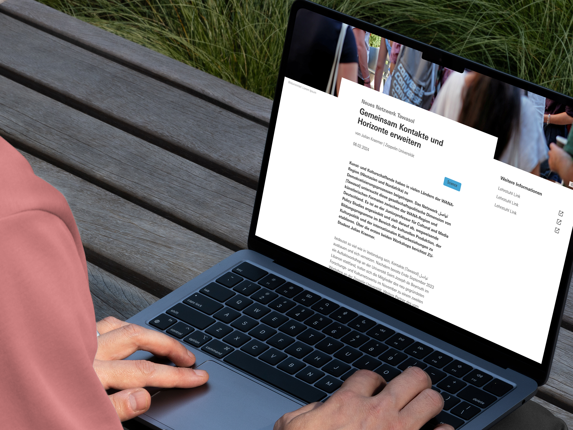
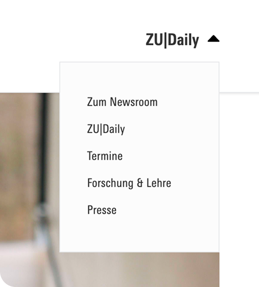
Architected a unified, accessible newsroom directly integrated into the main navigation. This centralized hub enforces corporate design consistency, drastically reduces user clickpaths, and provides an immediate, all-around view of the most recent university happenings.
The Deep Dive Overview
Before designing a single screen, I audited the university's existing digital architecture. I identified three critical points of friction that were severely degrading the user experience and internal communication:
Fragmented Ecosystems
Core information streams (News, Press, Events, and Research) were completely separated. They were housed under different, disconnected subpages—and sometimes even entirely different domains.
High Interaction Cost
Because information was buried in deep navigation trees, users had to endure exhaustingly long clickpaths just to find relevant, everyday updates.
The Bubble Effect (Silos)
The site’s architecture actively discouraged cross-campus discovery. Students and faculty only consumed news within their specific department's subpage, leaving them completely unaware of broader university activities.
The Opportunity
How might we architect a centralized hub that breaks down faculty
silos, slashes interaction cost, and provides a unified,
cross-campus experience?
To solve this, I mapped the core problems directly to strategic design solutions:
Fragmented
➡️ Unified
Instead of isolated pages, the Newsroom acts as a single aggregator, uniting all distinct information blocks into one scannable overview.
Departmental Silos
➡️ The "Big Picture"
Instead of forcing users to filter by faculty first, the default architecture was shifted to a chronological "most recent" feed. This exposes users to campus-wide happenings instantly, independently of their specific department.
High Interaction Cost
➡️ Instant Access
To reduce clicks, the Newsroom was elevated out of the sub-menus and placed prominently on the global homepage and within the primary main navigation.
The Research
I didn't rely on assumptions to build the new hub. To ensure the consolidated architecture would actually eliminate user friction, I rooted the ideation phase in targeted research:
Category-Based Flow Analysis:
I mapped the existing click paths required to access the four distinct information streams (ZU-News, Press Releases, Events, and Research). This revealed a disjointed architecture where each category forced users down a completely different, isolated navigation route, heavily increasing cognitive load. With the newsroom architecture we were able to archive a leaner and shorter click-path.
Before
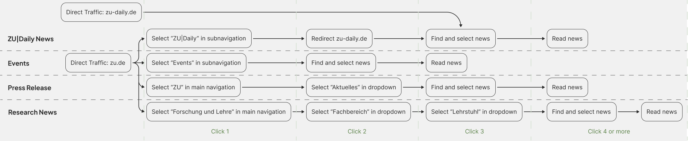
After

Competitive Benchmarking
I audited how other universities and corporate platforms structured their newsrooms. The goal wasn't just to see what features to include, but more importantly, to identify UX anti-patterns to avoid.
Good: Independent navigation within the newsroom facilitates navigation between the individual categories.
Good: Access to the newsroom directly on the home page makes it easy to get started quickly. Navigation within the newsroom simplifies navigation to the individual subpages.
Bad: No dedicated navigation within the newsroom subpages making navigation between categories difficult.
Bad: Infinity Scroll makes it difficult to find older posts and reach the footer.
The Insight
The research phase directly informed the structural rules for the new Newsroom:
Persistent Local Navigation
An independent sub-navigation within the newsroom is crucial for seamlessly switching between categories (News, Press, Events). However, Uni Heidelberg revealed a major anti-pattern: their local navigation disappears on subpages, effectively trapping the user. To prevent this, I ensured the ZU Newsroom maintains a consistent, persistent local navigation across all sub-levels.

Strategic Placement over Deep Linking
Benchmarking proved that hiding the newsroom creates massive friction (as seen with Uni Hamburg). Conversely, placing a direct entry point prominently on the global navigation (like LMU and Koblenz) is essential for a frictionless start and high visibility.

The Pagination vs. Infinite Scroll Decision
Analyzing other university websites proved that infinite scroll is highly detrimental in an information-heavy context. It breaks access to the footer and makes retrieving specific, older articles nearly impossible. Therefore, pagination was established as the safest, most functional choice to give users precise control over their navigation.
The Constraints
In complex B2B and institutional environments, design is rarely a straight line. During the initial phases, I had to navigate conflicting visions between different stakeholder groups.
Designing within Constraints
The initial high-fidelity designs had to be completely scrapped. Instead of viewing this as a setback, I used it as an exercise in constraint-driven design. Because the CD strictly limited color and UI elements, I leveraged extreme precision in typography, image sizing, and structural whitespace to create visual hierarchy and keep the Newsroom engaging without breaking brand rules.
The Misalignment
The Marketing department requested a bold, disruptive look—similar to an independent editorial site (like ZUDailyNews)—that deliberately stepped away from the university’s standard visual language.
The Pivot
After receiving an early sign-off from Marketing, I built out high-fidelity prototypes based on this bold direction. However, during the final review with the core deciding stakeholders, the requirement shifted: the Newsroom needed to integrate seamlessly into the overarching, highly restrictive Corporate Design (CD).
The Iteration Process
Phase 1: The Initial Architecture (Low-Fidelity)
In the initial phase, before the Corporate Design constraints were fully enforced, I built low-fidelity wireframes to map out the core Information Architecture. The focus here was purely structural: testing how to display four distinct information categories (with 4-6 teasers each) without overwhelming the user. These wireframes served as the foundation for the initial, bolder design direction requested by Marketing.
Phase 2: The Pivot & High-Fidelity Adaptation
When the requirement shifted to strictly follow the university's existing Corporate Design, I had to adapt quickly. Because the timeline was tight and the new brand guardrails were highly restrictive, I bypassed a second low-fidelity phase and iterated directly in high-fidelity.
Stripped of the bold UI elements from the first iteration, I had to solve the visual hierarchy structurally. I relied heavily on the principles of "Soft Minimalism"—using precise padding, whitespace, and clear typographic scaling within the brand's rules to smoothly guide the user’s eye down the page.
Before
After
The Result
The final Newsroom successfully unified the university’s fragmented digital ecosystem into one clean, accessible, and Corporate Design-compliant hub. By surfacing the most relevant updates across all faculties, we effectively broke down the information silos and gave users an immediate pulse on university life.
The Business Impact
Consolidating four distinct information streams into a single, prominent architecture delivered immediate, measurable results:
Up to 50% Shorter Clickpaths
Users now access critical updates directly from the homepage and main navigation, bypassing deep sub-menus entirely.
Higher Content Engagement
Replacing scattered sub-pages with scannable, categorized teaser boxes drastically lowered interaction cost and improved click-through rates.
Unified Brand Identity
Re-aligning the UI with strict Corporate Design guidelines ensured a cohesive, professional digital presence across all university touchpoints.
Alignment Before Pixels
Securing all deciding stakeholders (not just departmental leads) in the initial kickoff meeting is non-negotiable. Establishing strict technical and brand limitations at Day 0 prevents expensive, late-stage pivots.
The Key Takeaways
Every complex project is a chance to refine not just the product, but the workflow itself. Here is what this project reinforced about cross-functional design:
Constraints Breed Creativity
Strict Corporate Design rules aren't roadblocks; they are guardrails. Having limited UI elements forced me to rely on the fundamentals of "Soft Minimalism"—using typography, scale, and strategic whitespace to establish a clear visual hierarchy.
The Cost of High-Fidelity
Iterating and changing designs in the low-fidelity wireframing stage costs a fraction of the time it takes to rebuild high-fidelity, pixel-perfect UI. Validate the structure first; style it second.
KEEP READING
〰️
KEEP READING 〰️
Architecting a Modern B2B Service Hub
Transformed a frustrating legacy portal into an intuitive, high-performance platform. Reduced click-depth from 5 clicks to 1 and eliminated manual internal workflows to secure exclusive B2B knowledge.