Handelsverband Bayern
Transforming a legacy website into a modern service hub.
Timeline
1 Year
My Role
Lead UI/UX Designer
Skills
Design Systems, User Research, UI Design, Prototyping
Tools
Figma, Typeform
The Problem
The existing platform was outdated and functionally broken. Essential knowledge was hidden in PDF downloads, the mobile experience was non-existent, and the navigation structure confused users rather than guiding them.
The Solution
I led the strategic relaunch to modernize the platform. We transitioned from static documents to accessible web content, unified the visual identity, and introduced a "Quicklink" architecture to provide instant access to high-priority services.
The Deep Dive Overview
The Handelsverband Bayern (HBE) is the central support organization for retailers in Bavaria. Their members are business owners and professionals who rely on the website for accurate legal advice, contracts, and practical business support.
The legacy platform created significant friction for users trying to access daily business tools:
Deep Navigation Structures
The most urgent issue. Critical resources like "Standard Contracts" required 4–5 clicks to locate, forcing users to hunt through complex sub-menus to find basic tools.
Internal Jargon & Silos
The site structure mirrored the internal organizational chart rather than user intent. Users had to know which department handled a topic to find it, creating a high cognitive load.
Static PDFs & Hidden Knowledge
The association’s most valuable asset – "Praxiswissen" (Practical Knowledge) –was locked inside downloadable PDFs. This made content invisible to search engines (SEO) and unreadable on mobile devices.
The Opportunity
How might we leverage Quicklinks, a Topic Grouping, and Live Content to drastically reduce the search time for users seeking critical information?
To solve this, I mapped the specific pain points directly to structural solutions:
Deep Navigation
➡️ Quicklinks
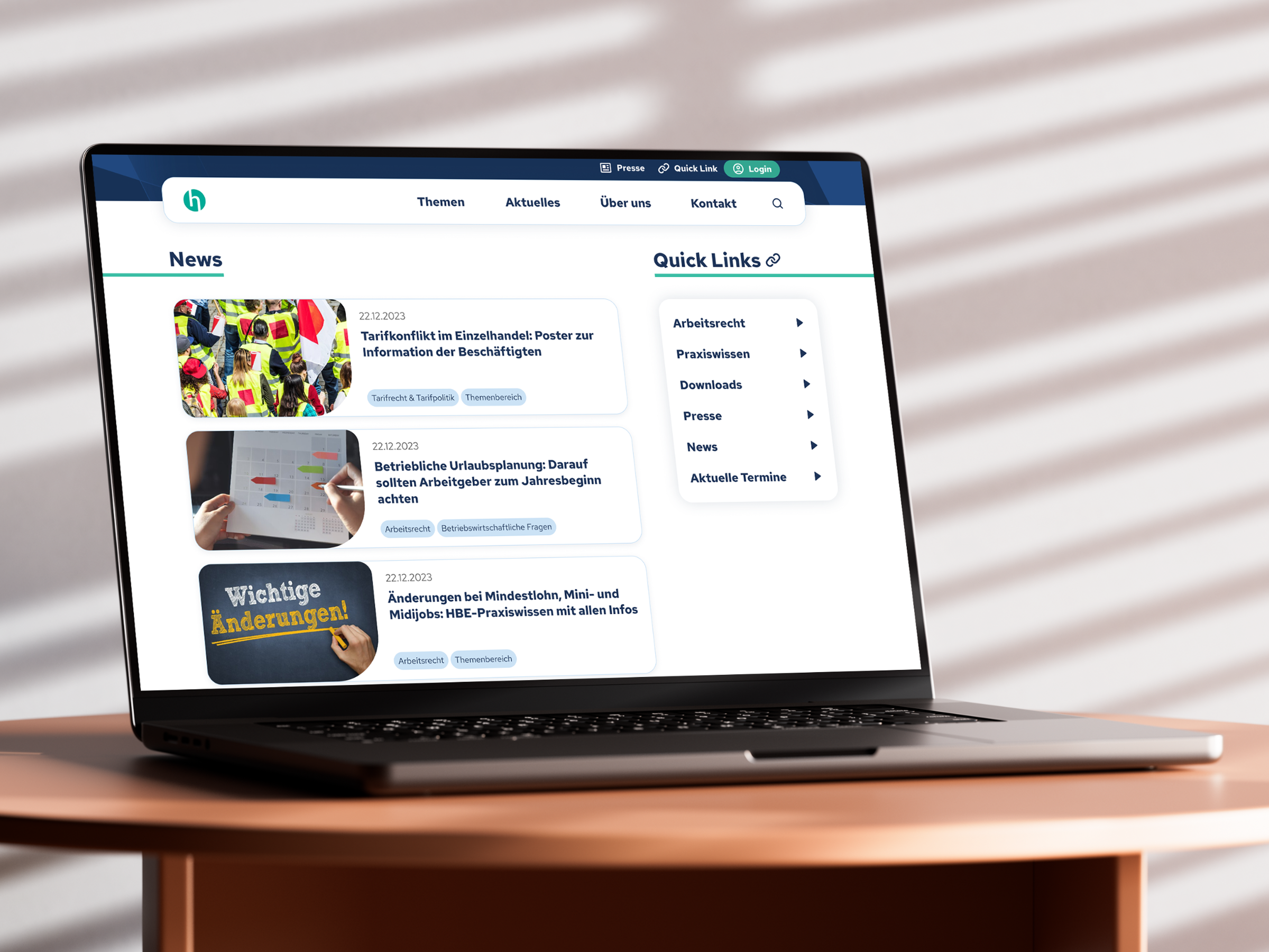
Instead of forcing users to dig through sub-menus, I introduced prominent "Quicklinks" on the homepage for the top 5 most-requested services (validated by user data).
Internal Jargon
➡️ Topic Grouping
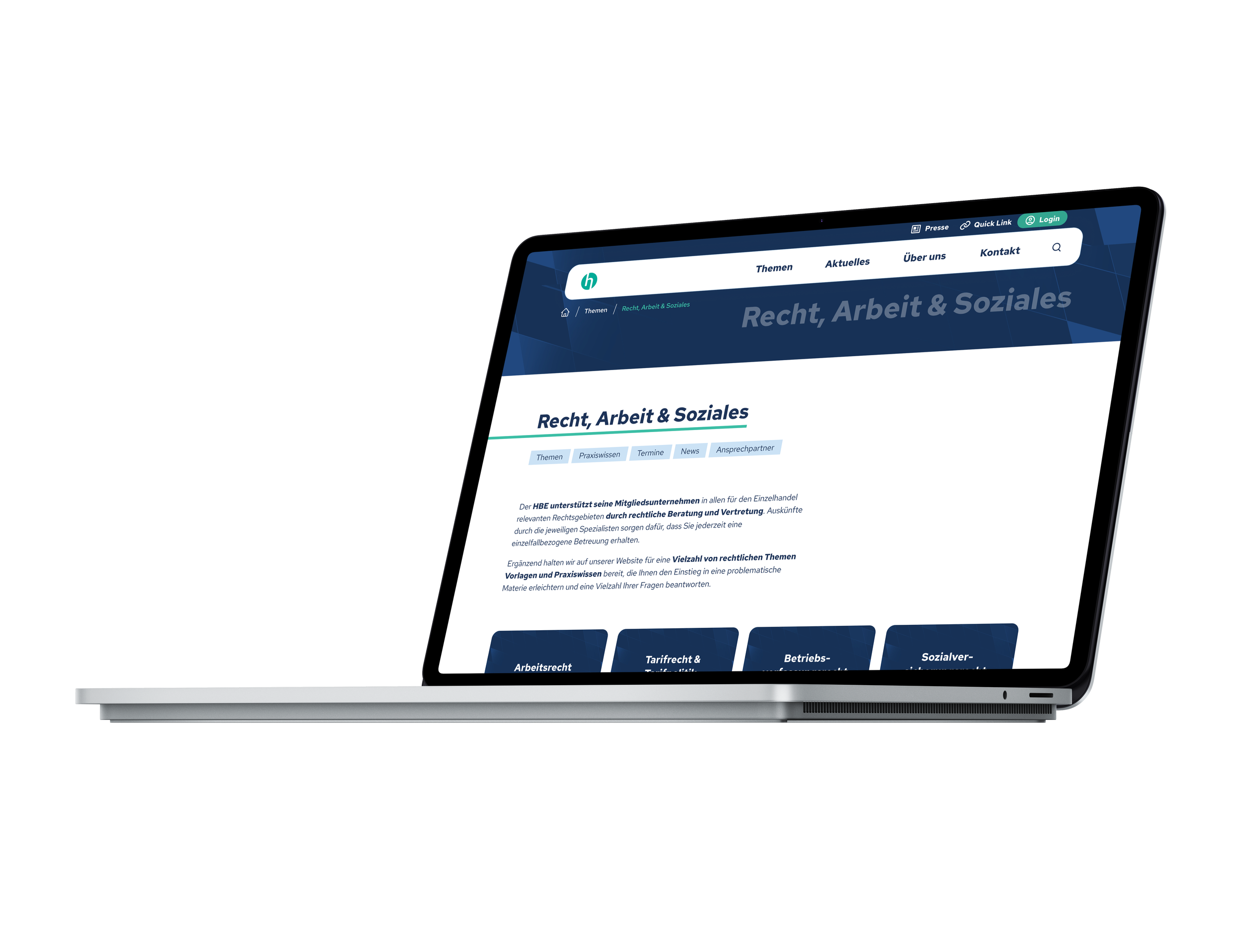
I replaced the department-based structure with a topic based content grouping to ensure findability regardless of internal hierarchy.
Static PDFs
➡️ Live Content
I unlocked valuable data from PDF downloads into searchable, SEO-friendly web pages, making the "Praxiswissen" accessible on any device.
The Research
We knew navigation was the biggest friction point, but we needed to know exactly where users wanted to go. I defined the new architecture by triangulating two data sources:
The User Survey
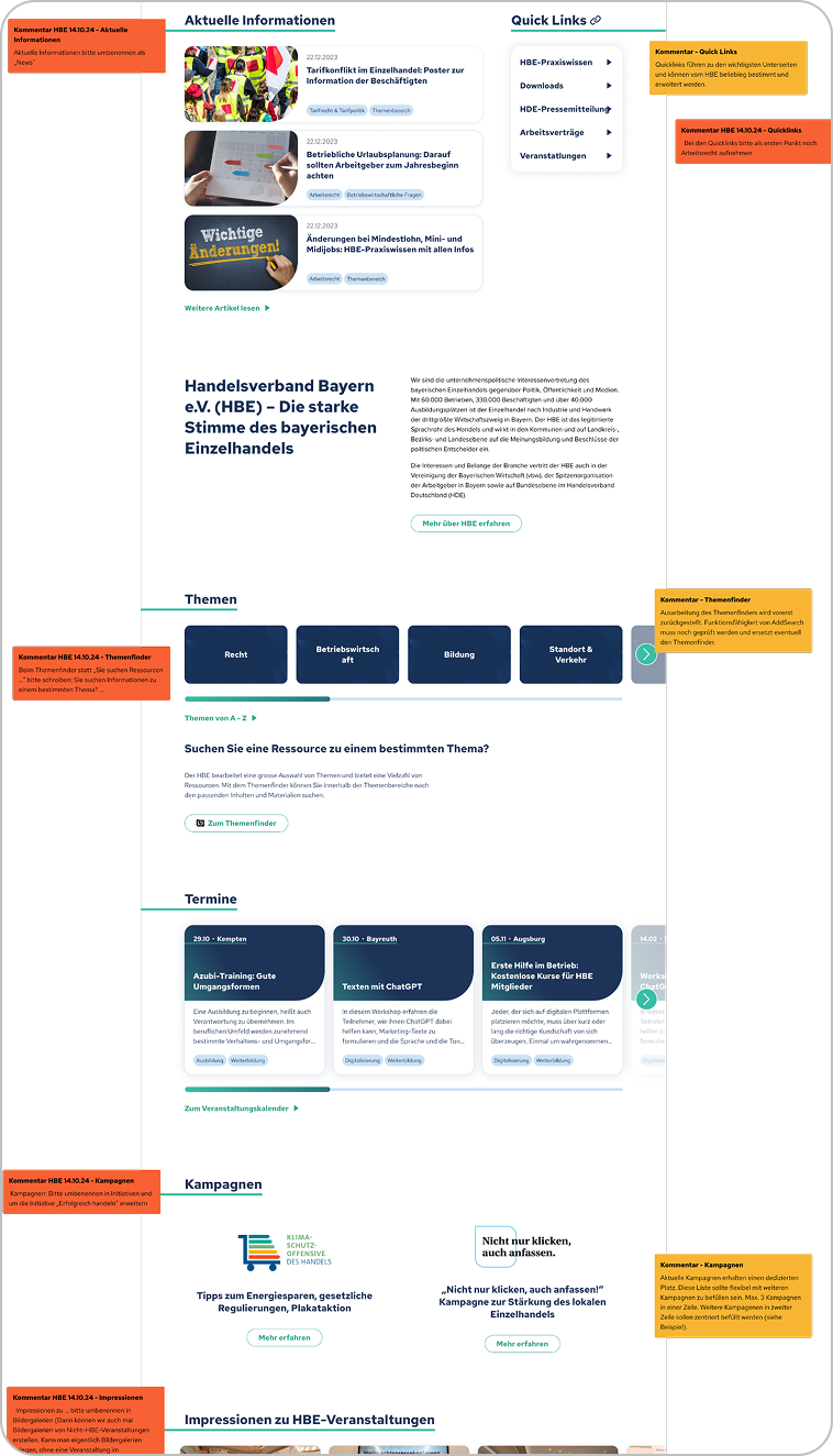
To validate our strategy, we surveyed active members (N=169) regarding their usage habits. The results highlighted the urgency of the redesign:
The "Search" Crisis
Satisfaction with the search function was critically low. Users described it as a "joke" and a "jungle," with many reporting they could never find documents without clicking through endless sub-pages.
Content Hierarchy
The data showed a clear hierarchy of needs. 81.5% of users visited primarily for "Praxiswissen" (Practical Knowledge) and 61.7% for "Arbeitsverträge" (Contracts). This data directly dictated the top 5 "Quicklinks."
The "Neutrality" Trap
While only 0.6% of users were "very dissatisfied" with the aesthetics, 35.6% rated it as merely "average" (3 out of 5). This confirmed the problem: the site wasn't ugly, it was forgettable.
Retiring the “Themenfinder”
Research showed a clear usability problem: over 50% of users had never used the “Themenfinder” (Topic Finder), mainly because the icon next to the search field did not clearly communicate its purpose and the path to results required too many steps. Instead of investing in a feature with low adoption, we chose to remove it and focus on simplifying how users find content.
We renamed “Services” to “Topics” to better reflect how users think about the content and reduced visual clutter in the navigation. To compensate for the removed feature and improve discoverability, we introduced AI-powered search so users can locate complex legal information without knowing the exact internal labels or terminology.
Before
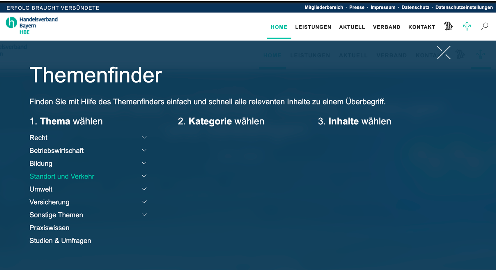
“Themenfinder” a multilevel topic search that users were not able to find and use.
After
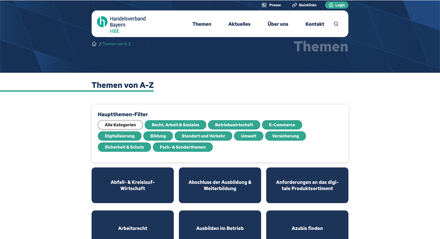
Topic overview with simple filter for easier usage.
Stakeholder Intelligence
Workshops with the employees revealed that the old site wasn't just failing users; it was actively hurting internal workflows and revenue:
The "Word-to-PDF" Trap
Updating a single typo in a "Praxiswissen" article was a multi-step nightmare (Edit Word Doc →Export to PDF → Re-upload to CMS). Moving to live web pages allows staff to edit text instantly via the CMS.
The "Leak" Problem
Premium knowledge (PDFs) was easily emailed to non-members, diluting the value of the paid membership.
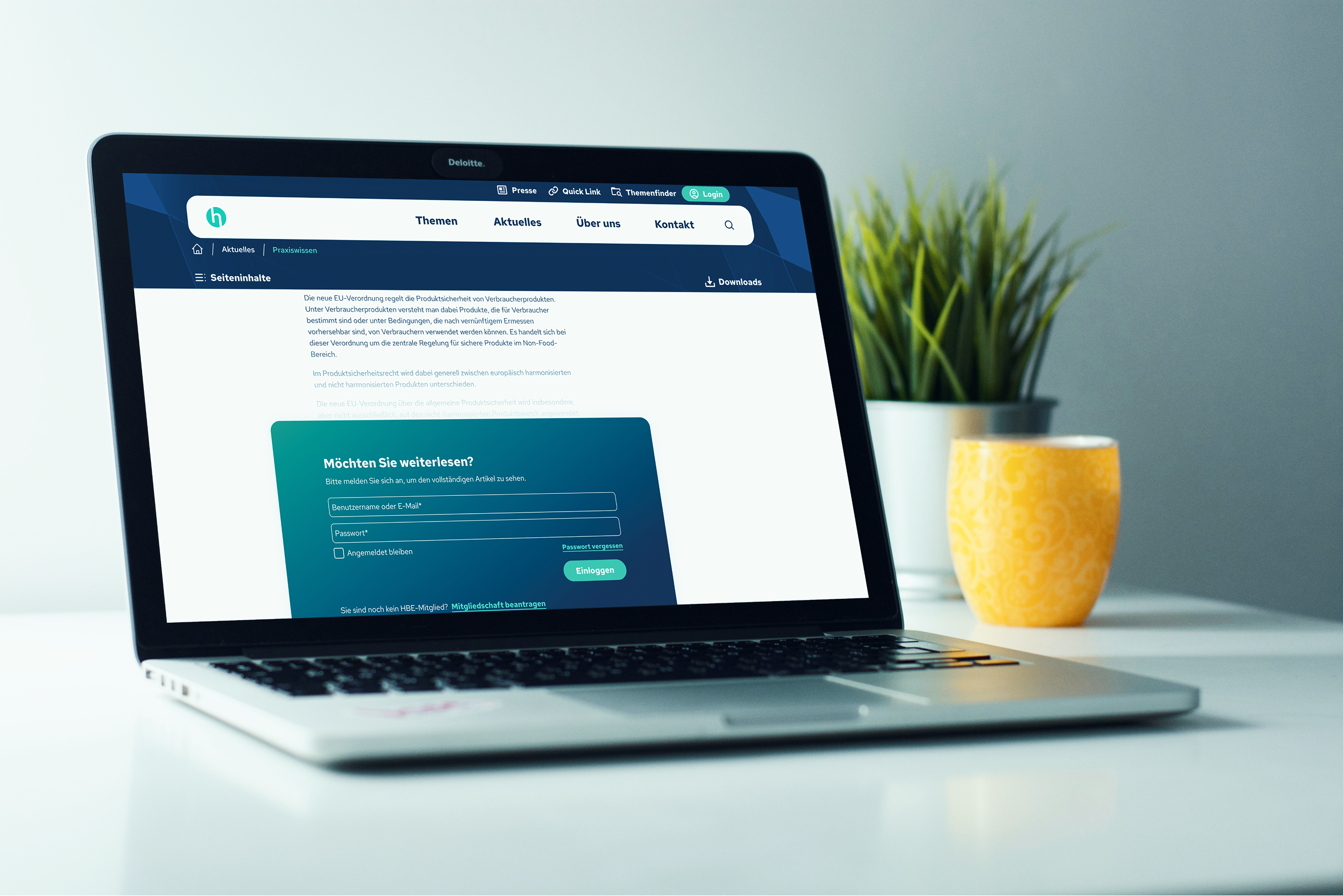
The Fix
We moved "Praxiswissen" behind a secure Login Wall as live HTML content. This ensures only paying members access the data and stops unauthorized file sharing.
The Iteration Process
Annotated Low-Fidelity Wireframes
Given the complexity of the content (legal texts, contracts, and news), jumping straight into high-fidelity design would have been risky. Instead, I started with annotated low-fidelity wireframes to validate the Information Architecture first.
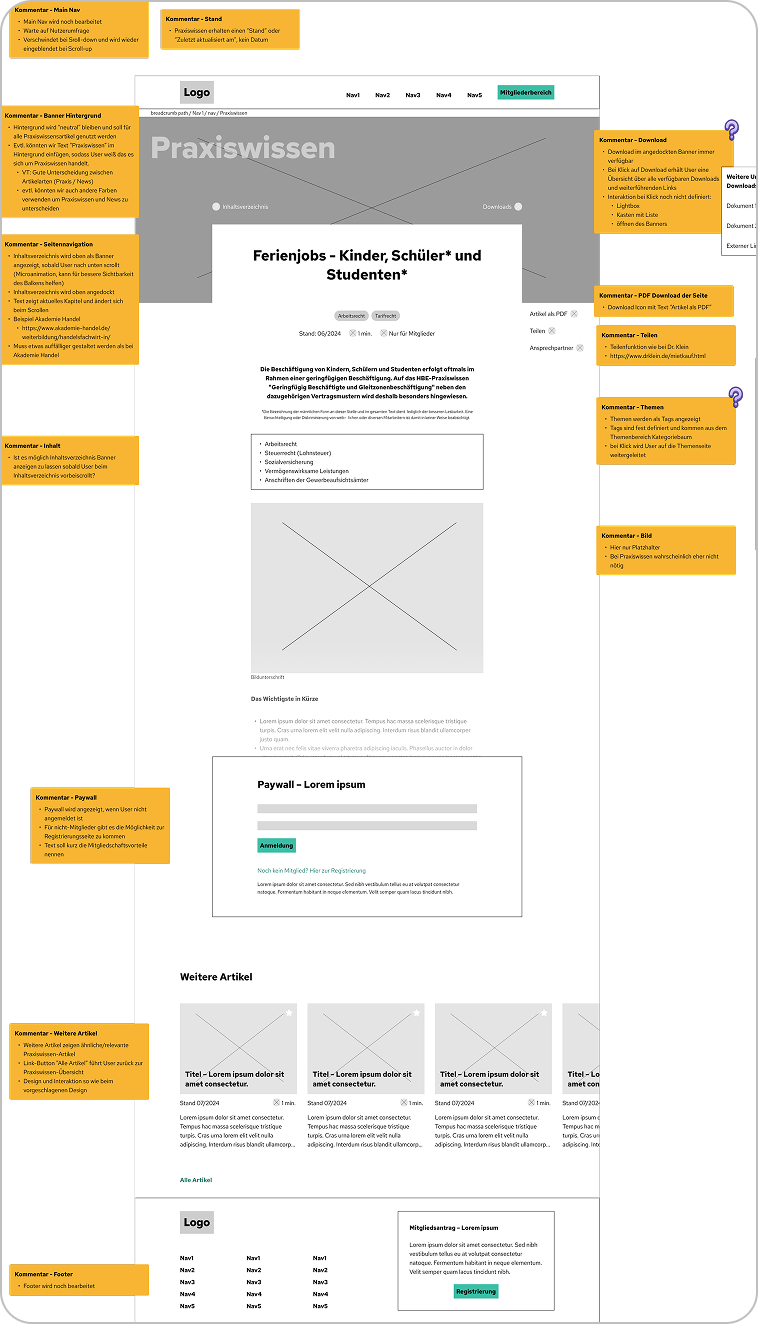
Continuous Feedback Loops
To ensure the system remained scalable, the process was not linear. Every increase in fidelity—from Low-Fi to Mid-Fi to High-Fi—was followed by a structured review gate.
The Workflow
Scalable Design System for more Efficiency
To manage the complex portal efficiently, I built a robust design system leveraging Figma Variables and Modes.
Seamless CMS Handoff
I aligned the variable nomenclature directly with the CMS requirements. Developers extracted clean, perfectly matched CSS via Figma Dev Mode, which ensured absolute visual consistency and streamlined the entire implementation process.
Instant Responsiveness
By mapping spacing and typography to semantic variables, we could instantly switch layouts between Desktop and Mobile modes, drastically cutting iteration time.
The Result
The relaunch successfully transformed HBE from a static file repository into a modern, dynamic service hub. We replaced the "Digital Labyrinth" with a streamlined, accessible experience that respects the user's time and reduces internal overhead.
The Business Impact
By aligning the architecture with both user intent and internal workflows, we achieved three critical wins:
Accelerated Time-to-Value
Replacing the confusing navigation with prominent "Quicklinks," clear "Topic Areas," and an AI-powered search reduced the click-depth for high-priority legal documents from 5 clicks down to just 1.
Process Optimization
We eliminated the manual "Word-to-PDF" workflow for employees. Content updates that used to take 20 minutes can now be done instantly inside the CMS, saving the support team hundreds of hours.
Visible Expertise (SEO)
Unlocking "Praxiswissen" from static PDFs into live HTML pages exposed the organization’s massive knowledge base to search engines, positioning HBE as the visible authority for Bavarian retail.
Asset Protection
Moving premium "Praxiswissen" (Practical Knowledge) from downloadable PDFs to gated, live HTML pages stopped unauthorized sharing, securing the exclusivity and value of the paid membership.
The Key Takeaways
Don't redesign unused features—remove them:
The survey proved that the "Themenfinder" was not used by users. Instead of trying to "redesign the UI," the best UX decision was to scrap it entirely in favor of an AI Search and clear "Topic Areas." Sometimes, simplification requires killing your darlings.
Internal UX is just as important as external UX
The shift from static PDFs to live HTML wasn't just a win for mobile accessibility and SEO. It drastically optimized the daily workflows of HBE employees, proving that good product design solves internal business bottlenecks, too.
A Design System must speak the developer's language
Creating Figma Variables is only half the job. Aligning the nomenclature exactly with the CMS framework is what actually bridges the gap between design and engineering, ensuring a truly seamless handoff.
KEEP READING
〰️
KEEP READING 〰️
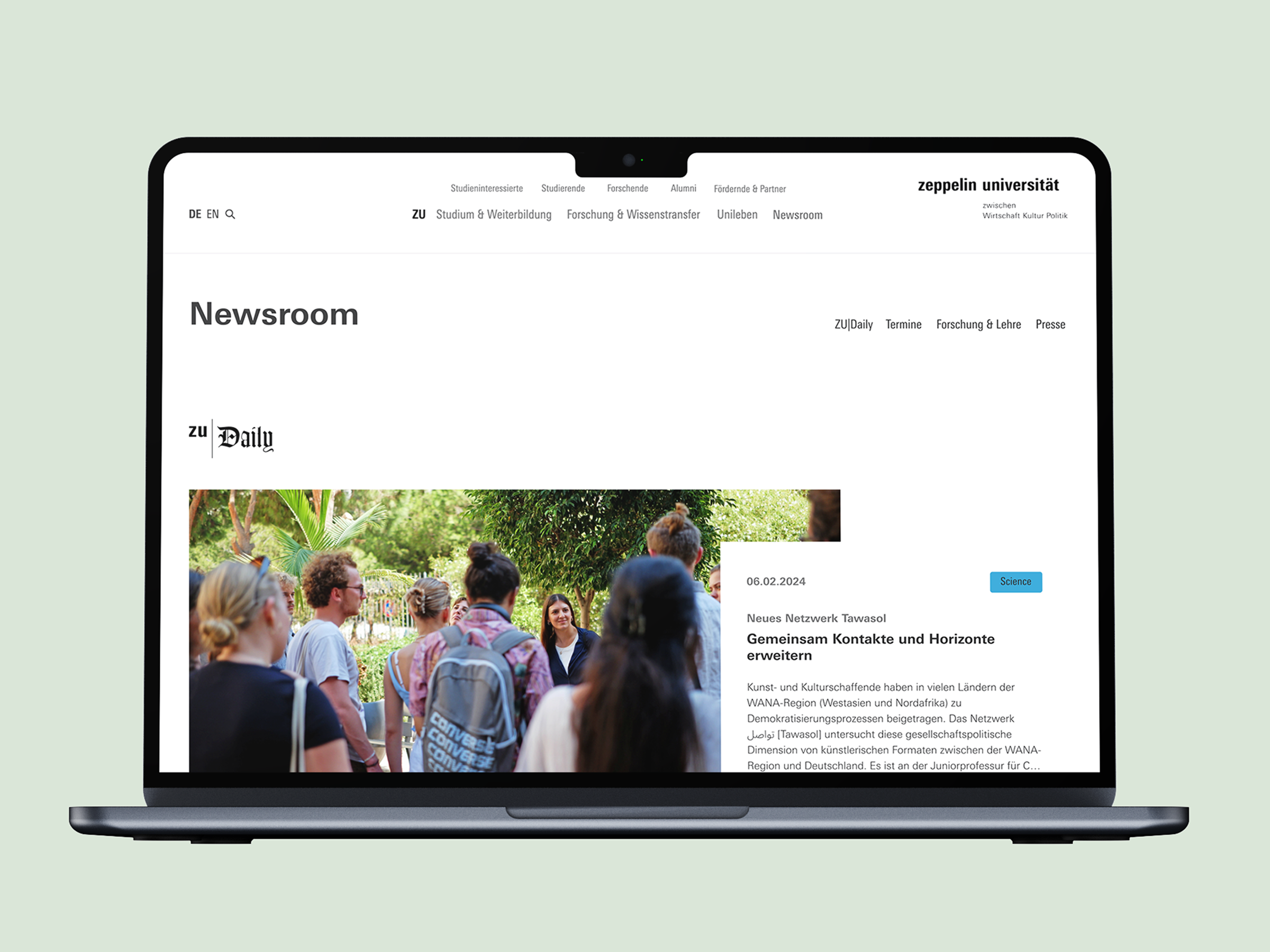
From Information Silos to a Unified Hub
Students and faculty were lost in 4 disconnected information streams. I architected a centralized newsroom that merges all updates into one accessible ecosystem—reducing clickpaths by 50% and strictly aligning with Corporate Design.