

Unleash Your Inner Chef with FlavorQuest
A responsive web application offering personalized recipes, unique cooking classes, and gamification elements for the ultimate cooking experience.
ABOUT THE PROJECT
FlavorQuest is an innovative and responsive recipe web app developed as an 8-week solo project during the Bootcamp. Fueled by a passion for cooking and a desire to promote healthy and delicious meals, this project showcases my skills in design and user experience. By curating diverse recipes and offering online cooking classes, FlavorQuest empowers users of all cooking experience levels to cook with confidence, providing a personalized and engaging culinary experience.
Project Time
8 weeks
Tools
Figma, Adobe Illustrator, Balsamiq, FigJam, Usability Hub
Role
UI/UX Designer
Responsibility
UI Design, UX Design, User Research, Illustrations, User Testing, Branding, Visual Design, Competitor Analysis, Usability Testing, A/B Preference Testing, Wireframing, Prototyping, Mockups
Problem
Existing recipe apps are cluttered, lack personalization, and fail to engage users effectively. Users struggle to find recipes matching their preferences and skill levels, resulting in frustration and wasted time. Vague instructions and a lack of tailored features lead to disappointing cooking outcomes. There is a need for a personalized and engaging recipe app that empowers users to cook with confidence, regardless of their expertise.
Goal
Create a user-centric recipe app that empowers users of all skill levels to confidently explore and enjoy cooking through personalized and engaging experiences.
Looking to skip the scrolling marathon? No worries, I've got you covered (and your secret's safe with me) ;)
Click here to dive right into the mouthwatering final design.
DESIGN PROCESS
In a pursuit of innovation and a desire to push the boundaries of creativity, I chose to embrace the Double Diamond design process for this project over the familiar Design Thinking approach, anticipating that its structured and systematic nature will provide a deeper understanding of user needs and enable the development of a visually captivating and purpose-driven web app that empowers users in their culinary journey, aligning with my passion for impactful design.
DISCOVER
In the Discover phase of my UI/UX case study for FlavorQuest, I conducted extensive market research, competitive analysis, and user interviews to gain valuable insights into user needs and desires. These methods were chosen to inform the design direction and create a user-centered experience that exceeds expectations, driven by my passion for delivering an exceptional and personalized culinary app.
-
Analysis of user preferences and behaviors related to recipe apps.
Examination of market trends in the culinary and recipe app industry.
-
Assessment of Allrecipes.com and Epicurious.com as key competitors in the recipe app market.
Evaluation of their community engagement features and user-generated content.
Analysis of the variety and quality of recipes offered by competitors.
Examination of the personalization and recommendation capabilities of competitor apps.
Comparison of pricing models and freemium limitations among existing recipe apps.
-
Number of Participants: Three participants were interviewed to gather a diverse range of perspectives and insights.
Reason for User Interviews: The goal of the user interviews was to understand the needs, preferences, pain points, and goals of potential users regarding recipe apps. These insights would inform the design and development of a user-centered recipe app.
Key Questions: Participants were asked about their cooking habits, challenges they face when cooking at home, their preferences for recipe apps, their interest in trying new cuisines and ingredients, and their opinions on convenience features such as meal planning and grocery shopping.
Findings on Frustrations: Participants mentioned frustrations with lack of inspiration, time constraints, and difficulty in finding relevant recipes that fit their preferences and skill level.
Findings on Needs and Goals: Participants expressed a need for easy-to-find recipes, a desire to improve cooking skills, and an interest in convenient features for meal planning and grocery shopping. They also showed enthusiasm for exploring new cuisines and attending online cooking classes.
Key Findings
Existing recipe apps lack personalized recipe recommendations and users find it frustrating to search through irrelevant recipes.
Participants express a need for convenience in meal planning, grocery shopping, and finding recipes that fit their preferences and skill level.
Users show interest in attending online cooking classes and have a desire to improve their cooking skills.
There is an opportunity to enhance community engagement and user-generated content without compromising quality.
Participants highlight the importance of a clean and simple user interface, advanced filters for recipe search, and cross-device compatibility.
A potential market for a recipe app targeting families and emphasizing healthy and sustainable cooking is identified.
DEFINE
In the Define phase of my UI/UX case study, I employed user persona development, user flow mapping, and defining the Minimum Viable Product (MVP) to create a user-centered vision for the recipe app. By understanding the target audience and optimizing user journeys, I aimed to design a focused and intuitive app that meets the specific needs of users, setting the stage for a successful and delightful culinary experience.
The User
Creating user personas is essential, as they provide a deeper understanding of my target audience, which consists of cooking enthusiasts and individuals seeking to enhance their culinary skills. This includes young professionals, busy parents, food enthusiasts, health-conscious individuals, and passionate cooks.
These personas guide design decisions by highlighting their unique needs, preferences, and pain points, ensuring a personalized cooking experience. Although only one persona is showcased here to save space, multiple personas were developed to inform later stages and cater to the diverse range of user needs within the target audience.

What do the user want?
Easy-to-follow recipes that cater to specific interest and skill levels
Provide tips and tricks
Pre-recorded cooking class including Q&A with real professionals
Receiving personalized recommendations
Connect with other food enthusiasts
Track progress by earning badges and points
And why?
Offers convenience and flexibility by allowing users to learn at their own pace and on their own schedule
Wide range of recipes catering to specific interests and levels
Users are driven by their desire to improve their cooking skills, learn new techniques and make healthy and delicious meals
MVP Features
In defining the MVP features, I carefully considered user needs, time constraints, and available resources as a solo designer. By prioritizing essential features that address user pain points and provide value, I ensured the development of a functional and viable recipe app while allowing room for iteration and improvement based on user feedback.
Advanced recipe search and filtering to easily find relevant recipes
Personalized recommendation based on behavior
Favorite and save recipes for easy access
Improved recipe details page layout
Gamification elements (earn badges, ranks and titles)
Social elements such as social sharing, community forum, reviews, Q&A

User Flow
Creating a user flow allowed me to visualize and optimize the journey users would take within the recipe app. By considering user insights and findings, the user flow helped me ensure a seamless and intuitive experience, guiding my design decisions and enabling users to navigate, discover recipes, and engage with the app's features effortlessly.
DEVELOP
In the Develop phase, I employed a sequential approach, starting with sketches, followed by low-fidelity wireframes, and ultimately high-fidelity wireframes. This method facilitated active user feedback and iteration, ensuring the final design of the recipe app resonated with user preferences and delivered an intuitive and visually pleasing experience. By prioritizing user preferences through these design iterations, I successfully crafted a product that users would prefer and find delightful to use.
From sketches to mid-fidelity wireframes
In the transition from sketches to mid-fidelity wireframes, I utilized methods such as Crazy 8's and pen and paper prototypes to refine the design and incorporate user insights. This iterative process enabled me to quickly progress from abstract concepts to tangible design solutions, ensuring the alignment of the low-fidelity wireframes with user needs.
Style Guide
A style guide was essential for me as it provided a reference for maintaining consistency and coherence in the design of the recipe app. By establishing guidelines for visual elements such as color, typography, imagery, and illustrations, the style guide ensured that the design decisions remained aligned with the app's desired aesthetics and user experience. It served as a valuable tool in guiding the implementation of the design, facilitating collaboration, and ultimately enhancing the overall visual appeal and user satisfaction of the app.
Inspiration
I created an inspiration moodboard featuring vibrant colors from citrus fruits and red fruits or vegetables. This inspiration guided the selection of a visually appealing color palette, contributing to a cohesive and engaging design that resonated with the project's target audience, while the style guide ensured consistency across typography, imagery, and other design elements.

Color Palette
I curated a purposeful color palette based on user research, market analysis and moodboard to evoke emotions of freshness, energy, and visual appeal. As an experimental project, I had the freedom to push boundaries and explore bolder colors, creating a visually captivating and adventurous design that went beyond conventional constraints.

Logo
I designed a unique logo inspired by the vibrant moodboard and character Kirby. The cooking peach served as a visual representation, enhancing brand recognition, establishing a distinct identity, and supporting the project's design decisions and progress.

Imagery & Illustrations
To ensure a consistent visual style for FlavorQuest, I created stylized illustrations for the various food categories and dietary restrictions featured on the web app. These illustrations use bright and cheerful colors that evoke a sense of joy and enthusiasm for users when they visit the website.

DELIVER
In the Deliver phase, I conducted usability testing, refined the design based on user feedback, and conducted an A/B preference test. This comprehensive approach ensured that the design solutions met user needs, provided a seamless user experience, and allowed for data-driven decision-making to optimize the final design.
A/B Preference Test
I conducted an A/B preference test to compare different icons for food categories and imagery. While the test results did not go as expected, testing multiple elements simultaneously, the user feedback gathered alongside the results was instrumental in creating a new version that combined the most favored elements. This iterative approach ensured that the final design aligned with user preferences and needs, making the A/B preference test a valuable tool for data-driven decision-making and user-centric design.
Usability Test and User Feedback
Usability tests were conducted and user feedback was gathered to validate design decisions, identify areas for improvement, and ensure the final design met user needs. These user-centric approaches, informed by earlier phases, played a critical role in refining the user experience and progressing towards a design that aligned with user preferences, resulting in a satisfying and intuitive user journey.
FINAL DESIGNS
The final design of my UI/UX case study was achieved through a user-centered approach, overcoming challenges such as A/B preference test results, uncertainty about color palette alignment, and adopting a bolder design approach. However, by incorporating user feedback and ensuring an intuitive and engaging experience, the end result successfully combined vibrant colors, intuitive design elements, and user satisfaction.

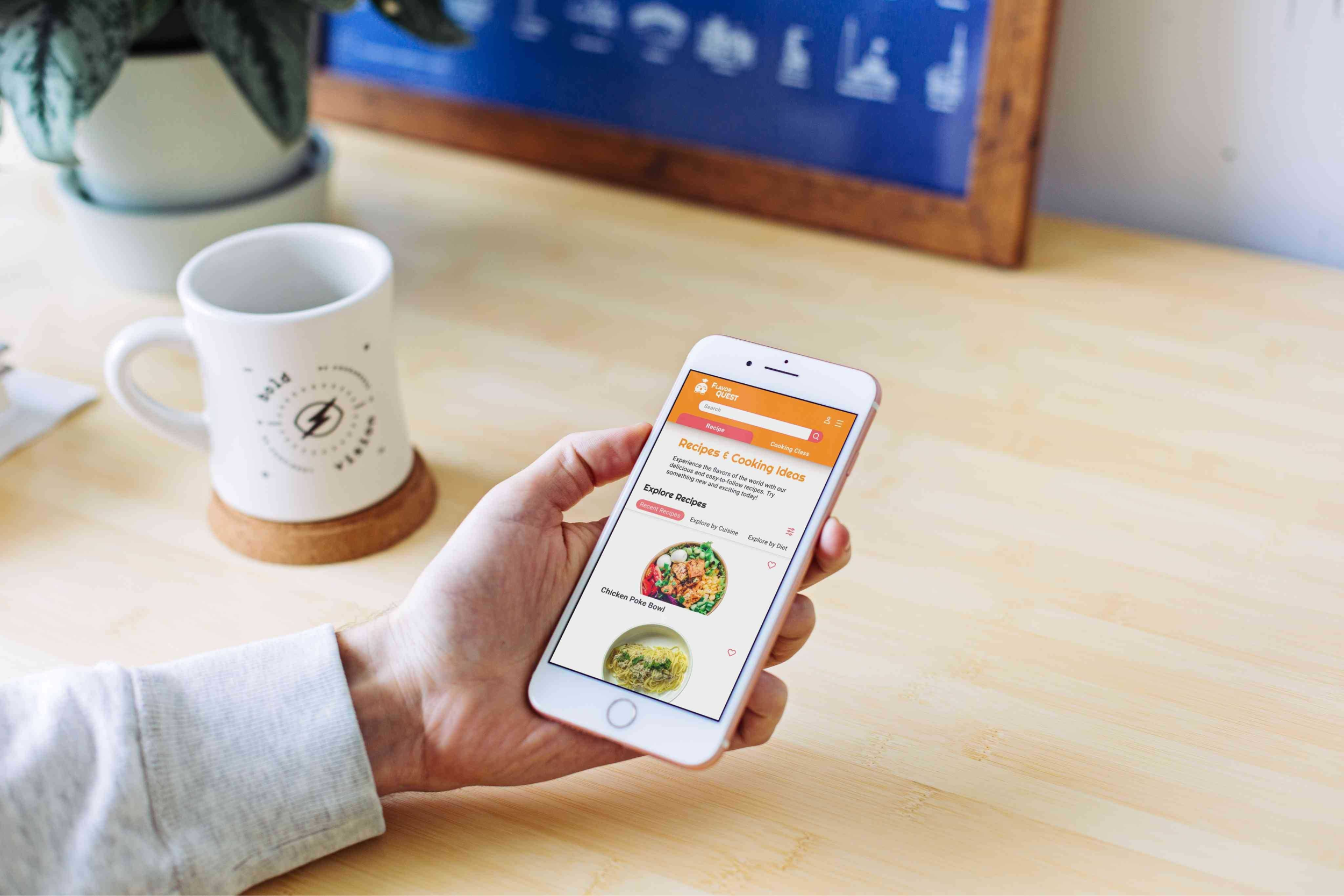
Responsive Screens
For this project I recognized the importance of responsive screens for a recipe and cooking app as it allows users to access the app conveniently from various devices such as mobile, tablet, and web. By ensuring a seamless and consistent experience across these platforms, users can easily browse recipes, follow cooking instructions, and engage with the app regardless of the device they prefer to use, enhancing accessibility and usability for their culinary journey.

Signup
Keep User Engaged
To create an engaging user experience in the recipe app, I incorporated a playful mascot inspired by vibrant fruits and prominently featured a call-to-action on the home page. By encouraging users to log in or sign up, the app can offer personalized recipe recommendations tailored to their preferences, behavior, likes, and comments. This approach enhances user engagement, satisfaction, and the overall enjoyment of their culinary journey.
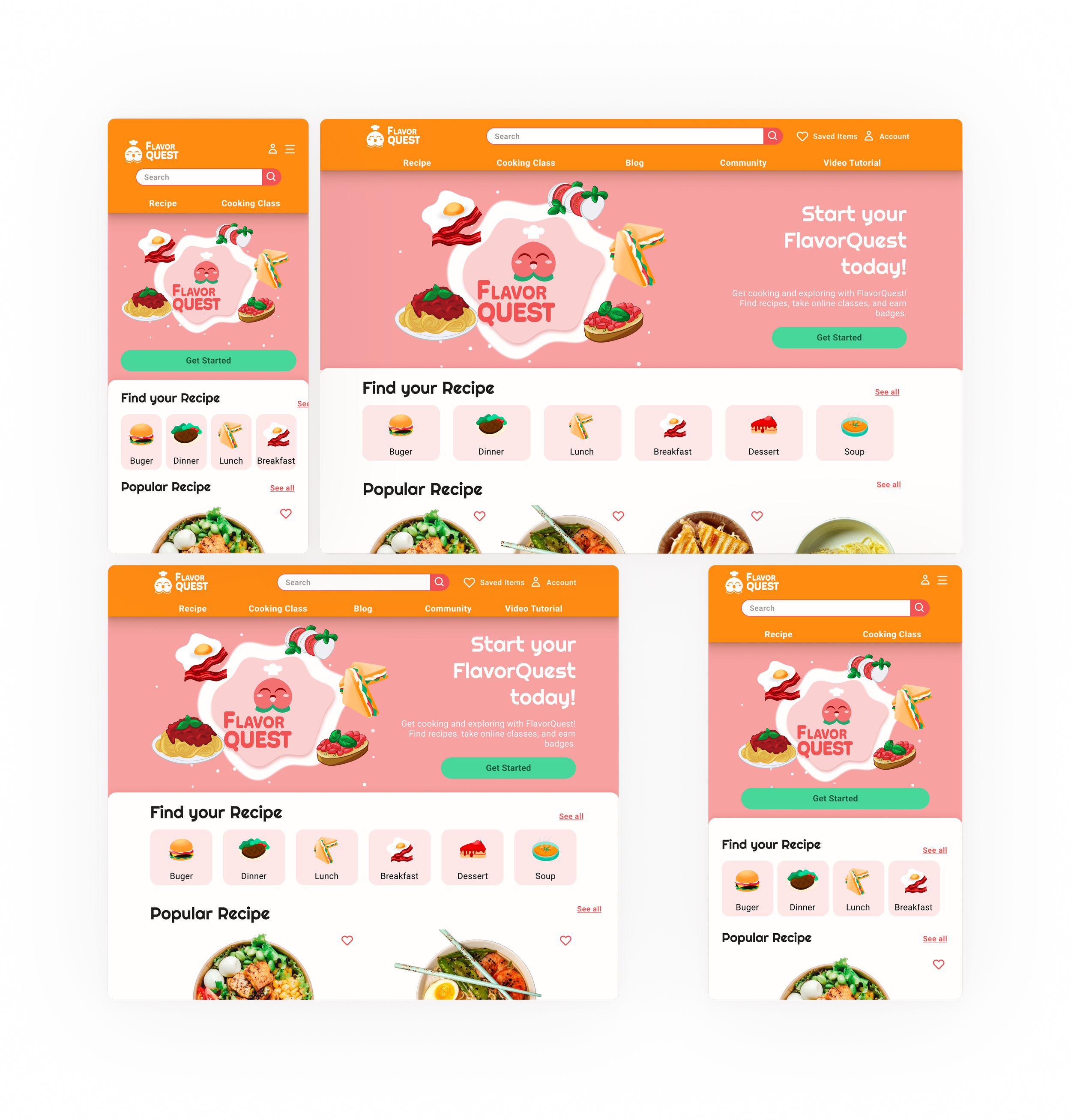
Home
Filter Options, Categories, Favorites
The app offers filter options for easy navigation through diverse recipe categories, allowing users to refine their search based on cuisine, dietary restrictions, ingredients, and meal types. The mobile version features collapsible tabs for condensed category views, and users can save their favorite recipes for quick access.

Recipe Overview
Improved Recipe Page Layout
The recipe page layout has been improved for a more intuitive and efficient user experience. The introduction of a breadcrumb path allows easy section switching, while an interactive ingredients list simplifies grocery shopping by allowing users to check off available ingredients.

Recipe Page
Gamification Elements for Higher Engagement
Gamification elements such as badges, titles, and a ranking system have been integrated into the app design to promote user engagement and incentivize progress. These features create a competitive environment and offer rewards for completing recipes and participating in classes, enhancing the overall user experience.
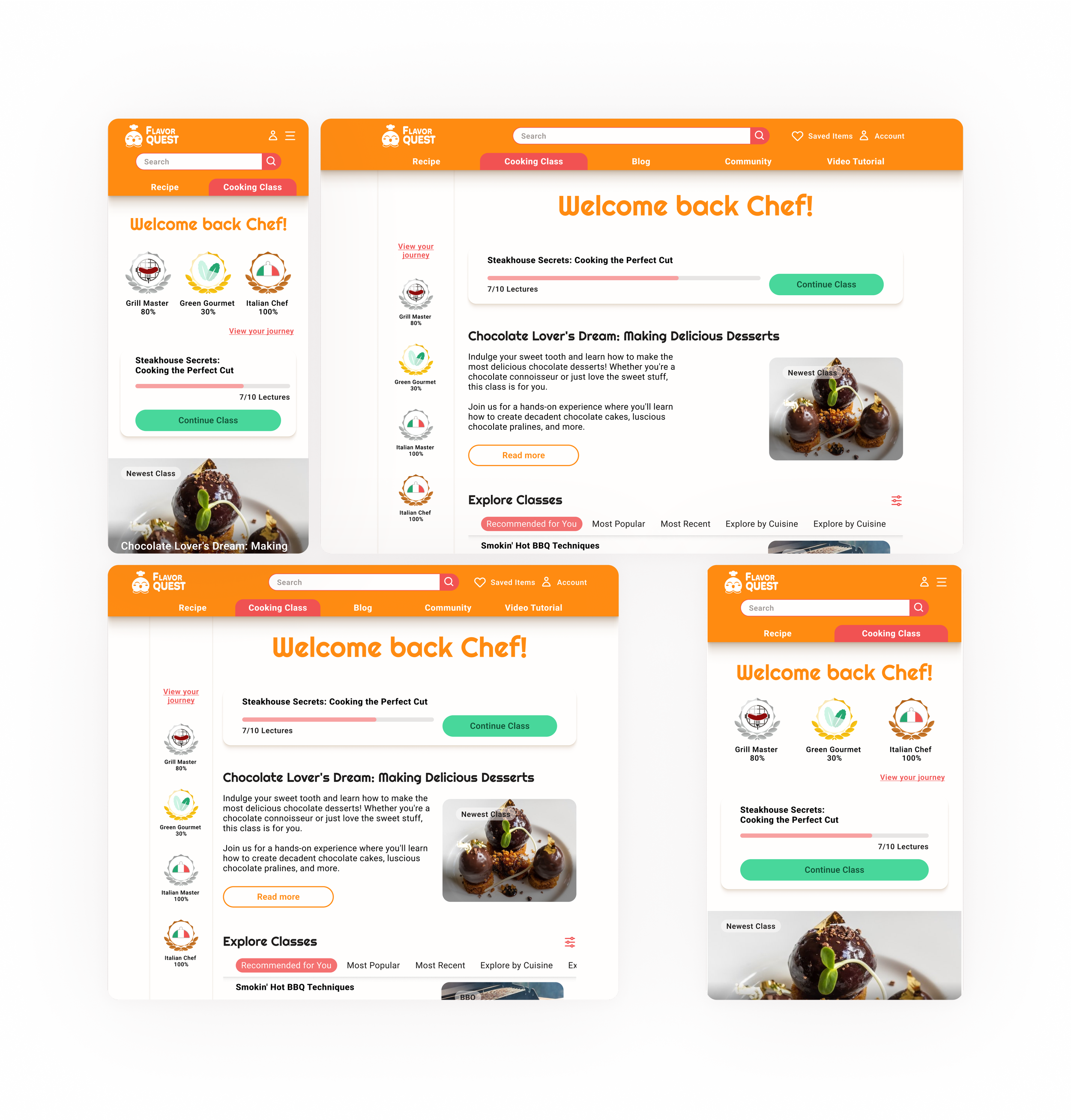
Cooking Classes
Social Interaction
A communication channel has been integrated into the app to facilitate social interaction and support among users. By enabling comments on videos and direct interaction with cooks, the platform encourages engagement, collaboration, and the sharing of experiences within the cooking community.

Video Lectures
Retrospect
What went well?
Clear vision and concept facilitated the smooth creation of the brand and style guide.
Effective use of moodboards provided ongoing inspiration and informed design decisions.
Engaging illustrations for the app enhanced enjoyment and skills during the project.
What didn’t go well?
Lack of specificity in defining the MVP led to the inclusion of unnecessary features, wasting time and effort.
Unclear objectives in an A/B preference test caused confusion among testers, impacting the ability to obtain clear and conclusive results.
Limited time constraints restricted the creation of only a few screens and their responsive breakpoints.
What can be improved?
Improvements
Adjust color scheme for broader appeal and inclusivity
Enhance gamification elements
Introduce icons for dietary restrictions
Additional Features
Integrate with online grocery stores for convenient ordering
Offer live online cooking courses for active participation
Implement a rewarding point system
Include video tutorials for specific cooking hardware
Introduce profile pages for professional cooks
Enable users to create personalized meal plans
Want to see more?
Click on the ‘View Case Study’ on the top nav bar to jump to another case study.